• MCA Banner Ad 4 728 x 90
  • Digital - This Space Available
  • United Properties Amira Digial Ad
  • Coan Payton & Payne July 2024 Banner
  • Advanced Exercise 2022 Banner 728 x 90

Cash Register Building rejuvenates its legacy

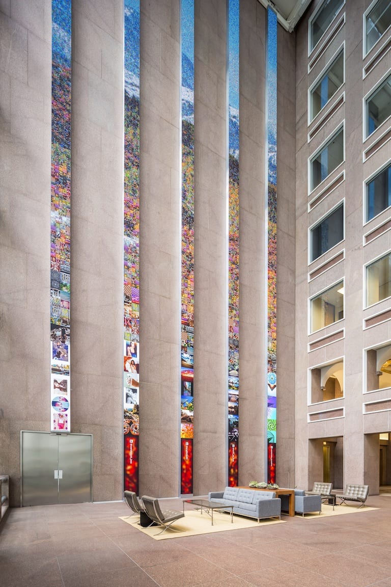
Wells Fargo Center lobby
The $17 million capital improvement program was implemented over a yearlong period. The lobby redesign, with the art and media installation, was completed in June. Courtesy Caleb Tkach
Cathy Mossman Senior vice president, Beacon Capital Partners LLC, San Francisco

Cathy Mossman
Senior vice president, Beacon Capital Partners LLC, San Francisco

Since its completion in 1983, the “Cash Register Building” has been a dominant and much-beloved focal point of the Denver skyline, so much so that today it is prominently featured on the city’s official logo. Given that history, the challenge of updating and refreshing such an iconic property – now known as the Wells Fargo Center – called for an innovative and transformative approach.

In order to do so, Beacon Capital Partners, the building’s owner, hired ESI Design with the goal of transforming the Wells Fargo Center to attract and engage with tenants and give the historic building a renewed sense of place. Rounding out the team is JLL/Callahan Management, which oversees the property’s day-to-day operations and manages Beacon’s other properties in Denver.

Ed Purver Senior designer, Creative Technology, ESI Design, New York

Ed Purver
Senior designer, Creative Technology, ESI Design, New York

The building was in great condition, but it was time for a refresh to bring it up to the standards of the other properties in the investment portfolio and to create a space that would attract and retain tenants. The approach was to transform the property for today’s tenants, with innovative design, state-of-the-art connectivity, modern amenities, award-winning sustainability and risk-management initiatives. In addition, the team wanted to create a more modern, social, comfortable lobby experience, and update the building’s ID and signage.

It was important to honor the building’s original architecture and vision. The building was designed by Phillip Johnson, the renowned architect whose landmark achievements include the Sony Building and the Seagram Building in New York, the Crystal Cathedral in California and the Glass House in Connecticut. Given the lineage, art and interior design had to be prominent and groundbreaking, but also draw inspiration from the history and location.

A standout in the renovation has become one of the most breathtaking and eye-catching interior spaces to grace downtown Denver. Within the building’s immense street-level glass atrium, where the design echoes the cash register shape of the roof, we added five 86-foot floor-to-ceiling LED columns that are six times the resolution of normal high-definition displays in height. When viewed together, they create one canvas that finds the right balance between tranquility and grandeur. Varying ever-changing visual imagery is inspired by the Colorado landscape to bring the outdoors in.

The result is a dynamic display that engages occupants and visitors from most vantage points within the atrium. As important, the sheer enormity of the media installation makes it visible from the exterior through the atrium glass, ensuring an experience that is memorable and engaging for street traffic as well.

The use of artwork as a unifying concept did not end with the media installation. Enoc Perez was commissioned to create a series of paintings and sculptures to be positioned throughout the lobby. Perez, whose work has been shown at New York’s Metropolitan Museum of Art, produced 14 large-scale paintings to grace the lobby’s niches and another five complementary and unique sculptures for the elevator alcoves.

The paintings all draw inspiration from the building’s unique shape, while the chrome-finished wood sculptures echo the interior finishes that the original architect used.

The final touches for the transformation included the installation of wayfinding signage, new furniture and lighting, chosen specifically to create a refreshed-yet-still-classic space with a new, more contemporary feel.

The building’s $17 million capital improvement program was implemented over a yearlong period. The lobby redesign, with the art and media installation, was completed in June.

What have we learned through this transformation? The overwhelmingly positive initial reaction have taught us a few valuable lessons:

  • An engaged tenant is a satisfied tenant. Incorporating state-of-the-art design and amenities that create a meaningful experience for the workforce can have an immediate impact on attracting and retaining tenants.
  • Partner with the best. It’s important to find a partner that understands your mission and vision. Beacon, committed to transforming iconic spaces into ideal office destinations, and ESI Design, a design agency that specializes in creating spaces that engage people, have had successful collaborations in the past. The team also included the Wells Fargo property manager, Gina Guarascio, and Greg Forge, the building’s director of operations.
  • Happy tenants mean happy investors. Property management is not the end game for Beacon – it is an element of the approach to revitalize and enhance the value of iconic properties. The focus is to create long-standing value. This strategy to attract a tenant roster replete with many of today’s leading innovative and growth companies is important to investors. It is important to cities, too.

Ultimately, we measure our success with the Wells Fargo Center and other properties not only by the satisfaction and increasing demand of our tenant roster, but also by how and if we have brought improvement and engagement to the larger community. By teaming up to transform office buildings and creating more distinctive workplaces in Denver, we have helped attract leading companies and high-end jobs to the city. Our experience has proven that by transforming office properties, especially through innovative design and art, we can help contribute to the vitality and energy that makes Denver such a special place.

Featured in the October 2016 issue of Property Management Quarterly.

Edited by the Colorado Real Estate Journal staff.